Monday, 12 December 2011
Photographs for Double Page Spread
Above are some of the photographs I took for my Double Page Spread. I kept the genre of music magazine in my mind therefore produced photographs that signified the Indie Genre therefore give the right meaning out. I used the middle picture because it portrayed the boys personalities and the genre of music very well.
Saturday, 10 December 2011
Production of contents page
In todays lesson, I began to produce my contents page. I used QuarkXPress to do this. I took screen shots throughout the time I was completing this task. In the end, I decided against doing a contents page that took over 2 pages because it wasn't needed nor was it what the magazines like Q and NME do frequently.
Thursday, 8 December 2011
Photographs for Contents Page
Above are some images that I took for my Contents Page. I used some of the images above that seemed more appropriate with my genre of magazine and article headings.
Tuesday, 29 November 2011
Production of front cover
In today's lesson, I began to create my front cover. I used Adobe Photoshop to create my front cover because this is the best programme to use for the task that I am set. I have included screen shots of my front cover as it is being produced below, so it is shown how I created it step by step.
Friday, 25 November 2011
Photographs for front cover
Above are the pictures that I took for my front cover. I made sure that there was direct contact throughout and I eventually came to the decision that I was going to use the very top image because it portrays a very Indie theme and is a very good photograph that suits my theme very well.
Tuesday, 15 November 2011
Article research
After deciding on my front cover and contents page, I then began to research double page spreads. I conducted this research to help me to prepare for how I wanted mine to look and the type of questions that I needed to ask the band. I used the Internet and music magazines such as Q and NME to help me decide the layout and style I wanted my double page spread to appear like.
I am interviewing a local band called The Gladstones. They are a relatively new band around however after seeing them perform at a charity concert, I thought they were incredible. They don't have much publicity however do have a facebook page (www.facebook.com/TheGadstonesUK) and individual twitter pages .
I would like my double page spread to appear like the picture below, with one main image taking up the page, and the text in columns with a drop quote. I also like how this article has a big drop cap.
I am interviewing a local band called The Gladstones. They are a relatively new band around however after seeing them perform at a charity concert, I thought they were incredible. They don't have much publicity however do have a facebook page (www.facebook.com/TheGadstonesUK) and individual twitter pages .
I would like my double page spread to appear like the picture below, with one main image taking up the page, and the text in columns with a drop quote. I also like how this article has a big drop cap.
I like how the magazine has stuck to the similar colour scheme in this article, and the way that it is laid out is very interesting and would suit the genre of my magazine and the personality of the band very well. The drop quote that they have used in this article is one that will entice the audience, I also want to have this effect and use a controversial quote in order for the article to appear very interesting.
Sunday, 13 November 2011
Planning production
For my magazine, I will have my front cover image as a Girl looking very Indie with Indie clothing e.g. leather jacket or wearing red. Her hair will be very messy and there will be direct adress. The background of the image will be a plain white wall to add extra texture to the girls hair.
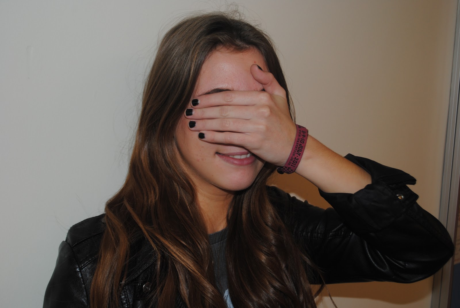
The images on my contents page will be; one of The Gladstones messing around, Take That live in Manchester, Leah Kent (girl from front cover) looking less serious and a few images of music and images that portray music e.g. an Ipod playing Rihannas album.
For my double page spread, I will again have another image of the boys messing around as in the interview it will be apparant that they are jokers therefore I want their personalities to reflect through the images.
Above are sketches that I have drawn which I would like my magazine to look like. This is almost a plan of what i'd like the outcome to be like.
I decided to change the idea that I had and put a male on the front cover, this is because the indie genre was portrayed better with the male and magazines such as NME and Q use male artists on their front cover an awful lot.
The images on my contents page will be; one of The Gladstones messing around, Take That live in Manchester, Leah Kent (girl from front cover) looking less serious and a few images of music and images that portray music e.g. an Ipod playing Rihannas album.
For my double page spread, I will again have another image of the boys messing around as in the interview it will be apparant that they are jokers therefore I want their personalities to reflect through the images.
Above are sketches that I have drawn which I would like my magazine to look like. This is almost a plan of what i'd like the outcome to be like.
I decided to change the idea that I had and put a male on the front cover, this is because the indie genre was portrayed better with the male and magazines such as NME and Q use male artists on their front cover an awful lot.
Subscribe to:
Posts (Atom)