Sunday, 30 October 2011

Questionnaire

I conducted a questionnaire on Microsoft Word. I asked questions which related to my music magazine and genre and which would help me to make decisions about the magazine e.g. colour scheme etc. I will print off 20 copies and get a variety of people to fill them in, in order to make the results reliable.
­­­­­­Questionnaire
1)      Are you male [ ] or female [ ]?
2)      How old are you?
­­­________
3)      What genre of music do you mainly listen to?
­­­­_______________
4)      Who is your favourite band/singer?
______________________
5)      What three words do you associate with Indie music?
____________________________________________
6)      What is your favourite colour?
____________
7)      How often do you buy a magazine?
once a week [ ] once a fortnight [ ] once a month [ ] less than once a month [ ]
If other, please specify: ________________
8)      What magazine do you currently buy?
_____________
9)      What do you like about this magazine?
_______________________________________________________________________________________________________________________________________________________________________________________________________________
10)  What do you dislike about this magazine?
_______________________________________________________________________________________________________________________________________________________________________________________________________________
11)  What articles do you most enjoy to read in a music magazine?
__________________________________________________________________________________________________________________________________________
12)  How much would you pay for a music magazine usually?
0-99p [ ]  £1.00-1.50 [ ]  £1.51-2.00 [ ]  £2.01-2.50 [ ]  £2.51-£3.00 [ ] more [ ]
If more, please specify how much you usually pay: ___________
13)  In your spare time, how much do you listen to music?
Daily [ ]  every few days [ ] once a week [ ] less [ ]
If less, please specify how much you listen to music:___________­
14)  What colours do you associate with the indie genre?
____________________

Initial plans

My magazine will be published fortnightly, I chose this for the time of publication as this is how often many other indie magazines publish a new issue therefore I feel that this is what works the best for this genre.
My magazine will be £2.00 because I think that is what will work the best.
My magazine will have 60 pages, because a lot of indie magazines have over 100 pages, however a lot of them also have less, therefore I thought I'd go in the middle because each different magazine has a different issue size.
Regular content in my magazine will include: evaluations of artists live, interview with an artist, facts about different artists, competitions that readers can enter, best single of the week, behind the scenes with a specific artist, upcoming events, posters, readers opinions on specific topics (different topic each week but same column)and an artists opinion on their favourite album of the month.
Feature articles will include festival gossip, free CD, questionnaire on different artists and what people like when they go see someone live, special review on an artist that has been around for years, win concert tickets, survey on the festivals in summer and music award shows.

Research in the market place

Indie magazine powerpoint
I used slideshare to research different Indie Magazines, I used media packs to do this. This task was so I knew some of the properties of an Indie magazine to help with my production.
View more presentations from Laurengibney

Analysis of double page spread

Friday, 21 October 2011

analysis of contents page

In todays lesson, I analysed a music contents page. This was to help me with my research for my own contents page.

Wednesday, 19 October 2011

Analysis of Front Covers


Thursday, 13 October 2011

Evaluation of school magazine


Monday, 10 October 2011

Finished contents page

This is my finished contents page. I am very pleased with it as it very similar to my plan. I used all original images that I had photographed and had the two sections on the contents page, under 'regular' and 'featured'. I made sure to follow the codes and conventions of a contents page for this type of magazine, therefore it suited well to the target audience.

Friday, 7 October 2011

Production of contents page

For the production of my contents page, I used QuarkXPress. I liked this program very much to use for my contents page, as it was very easy to use and I could fully engage in to the task and make a contents page that I liked.
Firstly, I included my title, I used a big bold bright title so the reader knows what page they are on. I kept to the colour scheme to make the magazine recognisable. I added 4 pictures to my contents page altogether, but the first one I added covered 2 columns as it stood out more. I also organised my contents page in to 3 columns, this was to make it very neat and tidy and easy to manage.


I then added a sub-heading which said 'regular'. I kept this bigger than other text, and again as part of my colour scheme. I decided to divide my contents page up in to two parts as this makes it look neater. I had a 'regular' section so readers would know what is regularly in the contents page.

I then began to add the context of the contents page, and what articles are on which page. I used a smaller font so the reader knows that this is the main context of the contents page. I organised the pages by 'Pg.04'for example, because I felt that this is the main way I could gain a lot of organisation within the production of the contents page, and make it look realistic.

After this, I added another sub-heading which was 'featured'. Again, I used a bold font that kept to the colour scheme. I used the word 'featured' so the audience knew what it meant, as it was not a regular occurrence in the magazine.

I then continued to write the page numbers and articles in, under the heading 'featured'. I kept the titles of each article very simple, so it didn't give away too much about the article.

I gave my magazine a background colour which was still part of my colour scheme. I like having a background colour in my contents page as this makes it differ to my front cover, and gives it a bit of colour.
This is my finished product. I added the school website and contact phone number, as a lot of magazines do this in their contents page. I also included 'head teachers notes' which in normal magazines would represent the editors notes. I thought that as this magazine is the 'back to school' special, in most magazines, it would include some form of letter from the person in charge e.g. editor or headteacher.

Thursday, 6 October 2011

Finished Magazine front cover


This is my finished front cover. I am very pleased with it overall, however obviously there are parts that I would improve. If I could of re-done this task, I would have perfected the layout much more, as I feel as though it is slightly scattered, although as this is a school magazine, it suites well with the target audience. I like how I stuck to my colour scheme throughout, yet didn't over-do it. The images I used are very clear.

Tuesday, 4 October 2011

Production of my school magazine front cover.

I used Adobe Photoshop to complete my front cover, I included images that I had took around school, and I then added text, including the masthead and quotes from interviews. To make it stand out I used a bold strip of colour underneath the bottom bar of text. I also used a blue and purple colour scheme as this is the schools colour scheme.


 This is the blank page of where I first began to make my front cover. I have shown what I did to complete my front cover in step by step images.

 Firstly I included my main images. I included them first so I could base the other parts of my front cover, including headings around my main images, as the images are firstly what draws the target audience to the magazine.
 I then added my masthead. As this is the main part of the text, and the one that people recognise and as it stands out the most, I put it on the top of the front cover so people immediately could see it.
 I then added my barcode and some information around it, including issue number and price.
 After that, I added some subheadings and labels to the images. I made the subheadings relatively interesting and to not give too much away about the said article or interview.
 I then added some more text and a bottom bar of text, which had a block of colour under it to make it stand out. I kept this block of colour suited to my colour scheme.
I then added some more text, including a quote from an interview for the main story in the magazine. I also added a star with a catchy phrase in, which said 'start of term special 2011' I made this stand out to show that this magazine is the start of term special, which could again make people want to buy it more, as it is a 'special edition' magazine.

Photographs for school magazine, contents page.

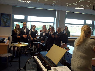
 This photograph is of a year 8 music lesson, rather than doing my main image as help! year 7, I will do it of this as it truly shows the fun nature of the music lessons.
 I took this photograph for the sports part of the contents page, it is similar to the one which I included in my front cover, however it is different.
 This photograph shows two year 7 students who are helping the receptionists for the day, I included this to help with the story on subject ambassadors.
This photograph is of a ticket from Berlin Museum which was on display, this goes with the 'trips' heading and shows the trip to Berlin.

Photographs for my school magazine front cover.

This photograph is used for my main image on my school magazine front cover. I took the picture in the library as this is a prominent location in the school which everyone recognises.
I took this photograph of one of the year 13 subject ambassadors, I used the background as all the charity work that sixth form do in order to obtain the positive attitude that is in this picture.
This photograph is of a year 7, I have made her stand above where I was in this specific pose in order to connote power, as this photograph goes with the help! year 7 article which gives year 7s a sense of hope and power.

This picture is of a year 12 Sociology class, I used this one in order to accentuate how hard-working the sixth form are, and to be included inside the magazine.
This photograph is of sports, I wanted to catch year 9's playing sports as this shows how much sports is a big deal in schools.

Monday, 3 October 2011

Rough layout of contents page

This is a rough sketch of my school magazine contents page, I have included featured articles and the other bulk of the magazine, and included which images are going to be on the contents page.

Rough layout of front cover

This is a rough sketch of my school magazine front cover, I have included which images are said to be in the specific places and the masthead of the front cover.

Plans for front cover

Title: Weatherhead news
Mis-en-scene: A main image of a Weatherhead student, to represent the school and the style of the magazine.
The front cover main image will be of a picture of a student, preferably outside the school, if not outside then someone recognisable inside the school. My front cover will include 3 columns, I will also include other images to let the target audience aware of what else I am including in my school magazine. The other images will be of:
  • The SSLT (head girl etc)
  • Students working
  • Drama GCSE class
  • Class of sixth form
  • Astro turf
I will also include a bar along the bottom of the magazine including what else I will include in the magazine.

Planning content


Contents
  Regular

  •  Extra curriculum
  •  Results
  •   News
  •  Staff interview
  •   Trips
  •   Dates for your diary!

Features
  
  • Subject ambassador
  • Tips for a successful year
  • Questionnaire
  •  Help! Year 7 
  • Upcoming
  • New information
  •  Student becomes Nobel Prize winner
  • Parent information
  • Autumn vouchers
  •  Quiz night

Pictures
  • Year 7 girl by part of school
  •  People playing sport
  • Berlin
  • Subject ambassador


Camera angles

I photographed many examples of different camera angles. This is because I used these images below as practice images so when I photographed my real images, I had some knowledge about what camera angles to use and what would look best, which would therefore make my work appear better.


 This photograph above shows a low angle medium close up.
 This is an example of a high angel long shot
 This is an extreme close up of the time
 This photograph is an example of a big close up of someone using a mobile phone.
 This is a close up of someone in 'nature'.
 This is an example of a two shot in medium long shot.
 This is an over the shoulder shot of someone writing.
 This photograph is a very long shot conveying isolation.
 This photgraph is of a medium close up.
 This is an example of a long shot.
 This photograph shows a picture that connotes friendship.
This photograph has connotations of stress.

Codes and Conventions of a music magazine

In todays lesson, I researched the codes and conventions of a music magazine.

Codes and conventions of a front cover:


  • They all include a central image, which enforces what is in the magazine, and also entices the audience to read the magazine, especially if there is a recognised face on the front cover who the target audience like and want to read about.


  • They all have a barcode.


  • They include feature stories, which are not usually in the magazine, this is to entice the audience to purchase the magazine.


  • A Masthead is also in all music magazines. It is usually in the colour that is the colour scheme used throughout the magazine. It can also make the brand, i.e. people recognise the magazine through the font style etc used. The Masthead also makes it clear to the audience who the target audience is, for example, if it is a rock music magazine, and they use a rock style font, the audience can recognise this.


  • Other images are also shown on the front cover, this is to show the audience what other articles are included in the magazine.


  • The front cover uses a specific colour palette throughout, they usually use around 4 colours. This is so the colour scheme does not take people's attention away too much from what is included in the magazine.


  • Front covers also include buzz words, such as; exclusive, plus and exposed, to make the reader encouraged to buy the magazine, because buzz words make the reader believe that the story is exclusive to their magazine.


  • The front cover includes graphic features, which are graphics that are added on after, these are added on to make the front cover more attractive and appealing to the target audience. They also make words and phrases stand out more, e.g. if they include colour blocks over the top bar of text, to make readers more obliged to read it.


  • The colour scheme of the magazine should suit the genre, for example a rock magazine should stereotypically use a lot of black and red to stand out to the target audience.


  • They include anchorage text, which is to anchor the meaning of the image, this is to show the reader what a specific image is about. It can also be used to make people want to read more, e.g. if they use a quote from an interview for a picture, it makes the reader intrigued.


  • A slogan is also used, as a positioning statement. The slogan gives the audience a glimpse of what the magazine is about e.g. "England's best RnB magazine" makes the target audience for this magazine, believe it is the best RnB magazine.


  • A website is also included, this is to advertise the magazine more, by giving another way for readers to gain insight in to things that are included in the magazine.


  • Codes and conventions of a contents page:
    • All contents pages use picture; this is to show the readers what else is included in the magazine, if it hasn't been previously stated on the front cover.
    • Most contents pages have the word 'contents' somewhere on the page to make it stand out, and to show what it is that they're looking at.
    • Headings are all included in the contents page, this is to entice the reader to read specific articles and stories, they make them bold in order for them to stand out.
    • Usually, an editors note is included. This is for the editor to express their feelings and opinions on the magazine. It also sometimes gives people chances to gain insight in to the production of the magazine. Editors sometimes to do this because they want the readers to feel close to the production of the magazine, and to believe that they can affect what goes in and what doesn't.
    • As previously stated in the front cover, the contents page also includes a main image, this is different to the one that is on the front cover, as it is usually focused on a different story, article or interview. This is again, to show the reader what is included in this issue of the magazine.
    • Some specific words are in bold, this is to make them eye-catching so the readers are drawn to these words.
    • They usually have a top bar of text, talking about either a competition that can we won or other aspects of the magazine. They include this so the reader can either enter the competition, or know what else is in the magazine.
    • A description of the story is usually there also, this is to describe what a specific story, interview or article is about. It doesn't give much away, but simply sums it up, enough to make the reader want to read more.
    • The contents page is usually divided in two parts and they are; features that aren't usually included in the magazine, and regular contexts. They split them in two so the audience can see what is usually in it, and what is new and a one-off.
    • The colour schemes in the contents page match those of the front cover and generally throughout the magazine. This can become almost a trade mark for some magazines.
    • Some contents pages include quotes from interviews which encourage the audience to read the interview as it makes them want to know more about the specific interview.
    • The contents page is split up in columns, it is usually 3-4 columns, this is to make the page look neater and easier to read for the reader.
    • In some magazines they include a picture of the front cover somewhere on the page, it is usually in the corner. This is to show the audience that the layout and colour scheme etc used is throughout the whole magazine.
    • Again, graphic features are used to improve the appearance of the contents page, and make certain headings bold and more attractive.